


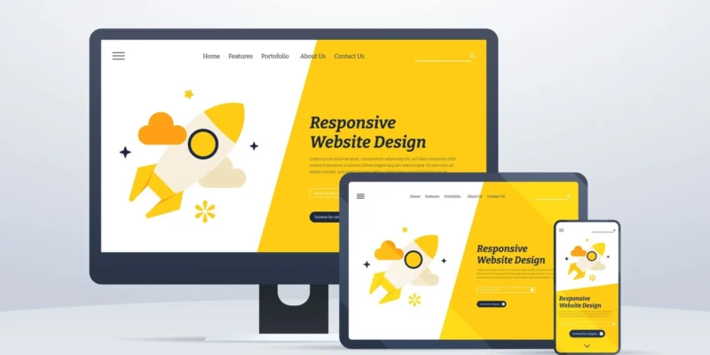
Building a responsive website in WordPress not only enhances user experience but also improves your site’s ranking in search engines. Whether you’re a small business owner or a developer, following a clear, step-by-step process makes mobile optimization achievable. Let’s dive in.
Why Responsive Design Matters
A mobile-friendly site adapts seamlessly to screens of all sizes—phones, tablets, and desktops. Google prioritizes responsive websites in search results, rewarding them with better exposure. As a best web developer in Lahore, I always recommend mobile-first design because it improves:
- User engagement
- SEO rankings
- Conversion rates
1. Choose a Mobile-Responsive Theme
Start with a modern, responsive WordPress theme. Look for:
- Built-in mobile layout
- Clean, lightweight code
- Fast loading speed
Recommended themes:
- Astra
- GeneratePress
- OceanWP
Using a high-quality theme sets the foundation for a responsive site that loads quickly and ranks better.
2. Use a Page Builder That Supports Responsiveness
Tools like Elementor, Beaver Builder, and Divi make responsive adjustments easy:
- Control column widths for desktop, tablet, and mobile
- Adjust font sizes and margins by device
- Preview and tweak your design for different screen sizes
As a WordPress developer, customizing responsiveness is much simpler with these easy-to-use tools.
3. Optimize Images & Media
Heavy images slow down your site, hurting SEO and user experience. To optimize:
- Use plugins like Smush or ShortPixel
- Serve scaled images (don’t upload full-resolution files)
- Use the
<picture>tag or WordPress’s built-in responsive image support
This ensures fast, branded page loads—especially important for mobile users.
4. Test Responsiveness Manually
Check different breakpoints:
- Shrink your browser window
- Use Chrome DevTools (Device Toolbar)
- Test categories and blog posts—not only your homepage
Testing across multiple pages avoids layout issues and ensures a consistent look everywhere.
5. Use Responsive Menus & Navigation
Responsive navigation is key:
- Use mobile-friendly menus (hamburger or collapsible)
- Disable hover-only menus on small screens
- Ensure clickable areas are finger-friendly (at least 44px touch size)
Good UX improves engagement and reduces bounce rate—both positive signals for search engines.
6. Improve Site Speed for Mobile
Site speed is crucial for both SEO and performance:
- Use caching (WP Super Cache or LiteSpeed Cache)
- Minify CSS/JS with Autoptimize
- Use a CDN (Cloudflare free plan works well)
A fast, responsive site signals quality to Google and helps you rank higher.
7. Add Meta Viewport Tag
Ensure proper scaling:
htmlCopyEdit<meta name="viewport" content="width=device-width, initial-scale=1">
Most responsive themes include this automatically, but it’s essential—missing or incorrect viewport settings break your mobile layout.
8. Optimize Fonts and Buttons for Touch
Enhance mobile UX:
- Use readable font sizes (16px or larger)
- Ensure linked text/buttons have enough spacing
- Consider mobile-specific buttons for call-to-action (e.g., “Call Now” or “Contact”)
9. Use Structured Data & Schema
Add basic schema markup like breadcrumbs, articles, and FAQ:
- Use Yoast SEO or Schema Pro
- Helps search engines understand and index your content better
Structured data can unlock rich results, boosting clicks and ranking potential.
10. Final Testing & Ongoing Monitoring
Before launching your site:
- Run Google’s Mobile-Friendly Test
- Check speed with PageSpeed Insights
- Check SEO details with Search Console
Ongoing updates and regular testing keep your site responsive amid theme and plugin updates.
Why Choose WordPress by Naveed Marwat
As a web developer dedicated to performance and results, I follow industry standards and Google guidelines to create responsive and fast-loading websites. My services are trusted by businesses in Lahore and beyond, helping brands:
- Rank higher in local and national search results
- Engage audiences with clean, responsive interfaces
- Convert more users with optimized mobile experiences